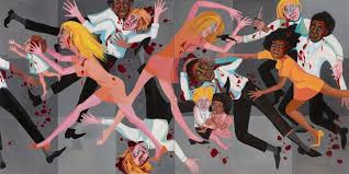
I am a Psychology major double minoring in Criminal Justice and Poli Sci. After I graduate I have plans to move to Washington, D.C., and lobby for prison reform and better access and funding towards mental health care in federal prisons. As a Psychology major I have been a part of two research projects, Take Me to Your Happy Place: Evaluation of natural places and measure of well-being in college students of interior Alaska, and Behavioral and health adaptations to excessive light conditions in arctic summers. I was lucky enough to present these posters at the Western Psychological Conference in 2017.
While I have never been much of an artistic person, I do like to think I have a special relationship with art. Although I don’t sculpt, draw or paint I do own my very favorite pieces of art that are a center piece in my home. Some of my favorite artists are Spanish painters Salvador Dali and Francisco Goya, as well as Sandro Botticelli who painted the “Birth of Venus”. While Dali was a surrealist, Goya was a romantic, and Botticelli was a Florentine Renaissance artist. I have attended a few First Fridays to better familiarize myself with Alaskan art, but I have also enjoyed amazing art museums out of the state and out of the U.S.. I was lucky enough to spend a few hours in the Kelvingrove Art Gallery & Museum in Scotland and see one of my favorite sculptures, the Harpy Celaeno.
Saturn Devouring his Son – Francisco Goya, 1819-1823
Below is the link I chose for an art-related website. The artwork and prints sold are from a local artist from Anchorage, AK. The artwork on this site does contain explicit nudity.
Yoshitoshi Tsukioka – 新形三十六怪撰 (Kiyohime becoming a serpent), 1890 Picture taken from Ronin Gallery
In the picture above, Yoshitoshi Tsukioka is depicting the ancient Japanese folklore of a woman scorned by her lover. As the story goes, Kiyohime was left by her monk lover, Anchin. After she came to the realization he was never coming back to her, she followed him to the river one day and transformed herself into a serpent so she could follow him in his boat. After Anchin saw her monstrous snake form, he tried to seek refuge in a temple. The monks accepted him and hid him under a bell for safety. After Kiyohime found him by his scent, she banged the bell loudly with her tail and then breathed so much fire unto the bell it melted and slowly killed him. After Anchin died, she threw herself into the river to drown herself. (Yokai).
One thing I love the most about traditional Japanese art is how the artists draw the waves of the ocean. When I first saw this piece of art the water reminded me much of “The Great Wave off Kanagawa” the famous Japanese painting of the big blue waves. Unlike that work though, the waves in this picture are dull and white/light blue, not giant and dark blue. With the sky above her being a light gray, and the moon barely shining, the true subject of this painting is Kiyohime’s desperation. Although her face is drawn with only a few lines of accent, it is very easy to see desperation and great sadness. With her story being one of violence and lost love, the conclusion is glaring. With her clothes tattered and her bent over in grief, it appears she is on the road of being desperate for vengeance. What is also quite astonishing in this picture is how the artist was able to draw every single strand of her long, black hair, and how he was able to put so much detail into her tattered clothes. The cloth, the patterns, and the varying blues, purples, and yellows.
Okumura Masanobu 宇治の橋姫 (Woman at Uji Bridge) date unknown Picture taken from Museum of Fine Arts
With scorned women apparently being a leading theme in Japanese folklore, the picture above is a depiction of the story of a woman turning into an “oni” to kill her unfaithful husband. In Japanese lore, an oni is a type of ogre of troll, usually with multiple horns coming out of its head. As the story goes, Hashihime prayed to a deity to turn her into an oni so she could kill her husband, his mistress, and the mistress’ whole entire family. For the transformation to be complete, she needed to bathe herself in the Uji River for 21 days, paint her whole body with red vermillion, and then separate her hair into five parts to create five strong horns. After the transformation was complete, she went unto her killing spree. Aside from those she intended to kill, apparently anyone else who saw her died from fear at the sight of her face. (Davisson).
With this story taken into consideration, Masanobu’s piece of artwork depicting this story is surprisingly not too violent or gory. With many traditional Japanese works containing beautiful, vibrant colors of red and blue, this specific work lacks much color. Instead the reds used are dull, much like the very little bits of yellow used. Like the first art analysed, I think this use of dull colors is so the main focus can be on the story at hand. Although her face lacks any color at all, the subject of this painting is her terrifying figure. While Hashihime kills her husband’s mistress as well, this is only focused on her killing her husband, which I find interesting. You can see her devilish, monstrous face, with her husbands turned away from her as she grabs at his scalp. Although this painting may lack the gore the story embellishes, it is nonetheless an incredibly telling, and amazing work of art.
Utagawa Kuniyoshi 四谷怪談 (Yotsuya Kaidan) 1836 Picture taken from Wood Block Prints
In this lore of a woman scorned, Oiwa was married to a samurai named Iemon. Iemon wanted to end Oiwa and his marriage, because he wanted to marry a rich locals daughter who had fallen in love with him. To end their marriage, Oiwa was sent poisoned medicine. To Iemon’s dismay, the poison did not kill Oiwa, but caused her to become incredibly disfigured. Clumps of her hair fell out, her eyes became bulbous and one drooped out of her head. In a wave of anger and confusion, she accidentally killed herself by falling on a sword. Her ghost continued to haunt Iemon, and she went so far as to make her face appear on his new bride, causing him to accidentally decapitate his new wife at their wedding ceremony. (Pekarik).
In this piece of art, Oiwa’s deformities are amazingly depicted. Her droopy eye, her falling out hair, the grimace on her face, even her teeth look rotted. Her crouched position and her hands in the form of claws truly help show how monstrous she is supposed to be. Although at first glance this drawing may look super in depth with much detail, at second glance you can see that her whole body and face is made up of very few lines. Much like the first picture shown, Kiyohime becoming a serpent, Kuniyoshi is able to depict so much from only a few lines, especially in the area of the face.
All of these different stories of scorned women have allowed such beautiful works of art to be created. Stories with such intense, violent emotions make incredibly intriguing pieces of artwork. Although all of these stories are of women turning into monsters, they are also stories of revenge and maybe even acceptance. With this being said, I would love to have these pictures in my home.
Petr Pavlenksy from left to right: “Fixation”, 2012 and “Nailed Scrotum to the Red Square”, 2017 Photos taken from The Guardian
From what you have now observed, you can see that Petr Pavlensky is a Russian contemporary artist that most would agree is pretty extreme in his acts. In the first picture, “Fixation”, Petr sewed his mouth shut. This was an act of solidarity for members of a Russian feminist protest group “Pussy Riot”. Three women from the group had been arrested for “hooliganism” and condemned sacreligious (Haynes). In the second picture to the right, Petr nailed his own scrotum to the Red Square in Moscow. According to onlookers, he stripped naked in less than a minute, and then began to nail himself to the icy cobblestones of the Red Square. Pavlensky said this was “a metaphor for the apathy, political indifference and fatalism of modern Russian society” (Walker). In an interview, he said he viewed this as an act of strength, and quite literally, an act that stopped authorities from taking him away from the Square, since he was obviously unable to move himself (Walker). These acts of political protest and aggressive statements of defiance were aimed at the long arm of the Russian justice system, and their lack of morality. Although I can agree these images are difficult to look at, I believe one of the most important aspects of art is an uncomfortable, abrupt, forceful look into the reality of what they are trying to convey. Yes, Petr’s work may be viewed as violent, offensive, and harsh to some, but as we have learned, art mimics and interprets the cultural features of its time.
Ti-Rock Moore from left to right: “Confronting Truths: Wake Up!” 2015, and “White Mirror” 2017 Photos taken from Gallery Guichard and 1st Dibs
Although Petr Pavlensky and Ti-Rock Moore seem like very different artists, they both use stunning and uncomfortable elements to get their point across. While Pavlenksy was protesting against the injustice of the Russian government, Moore is speaking towards the injustice and racially motivated crime towards African Americans perpetrated by police officers in the US. In the first photo, Moore created a life-sized sculpture of Michael Brown, a young, unarmed man who was shot by police officers. When speaking of the exhibit, the gallery co-owner, Andre Guichard offered a chilling sentiment, “Artists have a responsibility to record history, this is part of American history.” (Cascone). The painting to the right, “White Mirror”, whose name is a play on Netflix’s Black Mirror franchise speaks towards not only the paradox of the upside down flag (“where all men are created equal” is not true in this society) and “neon white signals the strength of white supremacist ideals within the American fabric and prompts the viewer to question the country’s current climate.” (Moore). While this may appear as just a plain neon piece of art, after reading what Moore’s meaning was behind the art, it looks incredibly haunting. The white glow no longer gives any sort of calm or relaxation that smooth lights may give some, but instead it gives me an emotive response of sadness and frustration. Both of the pictures I chose by Ti-Rock Moore show the frightening reality of how our world is functioning. While we have spent much of this class appreciating works of the past, the works I have chosen are of what is happening right now. Moore has been able to reach an audience with portrayals of horror and violence that are meant to strike people right in the heart.
Photographer and artist An-Sofie Kesteleyn resides in Amsterdam but came to the US after hearing of a 5 year old boy killing his 2 year old sister with a practice rifle. While it was deemed an accident, Ms. Kesteleyn had never heard of such gun violence in the Netherlands, let alone allowing a young child to even own a gun. There, only police officers are allowed such weapons. After coming to the US, she visited Tennessee, Alabama, Mississippi, Louisiana and Texas to take photos of these incredibly young gun owners. She chose to take the photos in their rooms, as a reminder of how young these children truly are. Accompanying the photos are two pictures drawn by each child; Kesteleyn asked the children to draw a picture of what scares them the most. On the left you see a young girl very proudly holding her pink Crickett rifle, with her picture saying “I am scared of zombies”. On the right you see a young boy also very proudly holding his rifle, with his drawing saying “My bigest fear is bears because if you get in thier terotory they will chase you for a long time”. (Schiller). In this series there are more photos of other children, and all of their fears include zombies, werewolves, bears and dinosaurs. Gun violence in America is something many of us have grown up with. It was a part of my elementary, middle and high school education to know what to do if a gunman came into the school. While gun violence is horrific, it has become somewhat normalized due to its prevalence. Aside from how chilling this photo set is, I believe one of Kesteleyn’s points was this: “your friendly neighborhood school shooter”. School shooters aren’t some big, bad, evil monsters. While they may be bad (obviously), they are the kids you know. The kids you go to school with, the kids you hangout with at recess.
Protesting against politics, political leaders and laws has been going on since 1913 when Gandhi organized the world’s first ever massive civil disobedience campaign. While what we have been protesting has changed and developed over time, it is a part of arts nature to recount history and the present, and also be a medium used to shock and inform. That’s why these pictures and these artists were chosen. While this art may be uncomfortable to look at (in fact this is the only art I’ve used so far in this class that I would not want hanging in my home) it shows the struggles the world is facing today. A dictatorship in Russia, the Black Lives Matter movement and the prevalence of gun violence in America.
The Harlem Renaissance was a cultural movement during the 1920’s which aimed to gain equal rights amongst African Americans and Caucasians. During this time period, amazing pieces of work were being created to showcase the struggles, hard worked triumphs, and pain that accompanied such a time as this. One artist, Faith Ringgold asked herself, “How could I, as an African American woman artist, document what was happening around me?”. She was able to achieve the answer to this question by this work of art that is depicting racial relations in the United States in relation to riots happening all over the country. (MoMA). I know this picture is small and pixelated, so if you click on the link provided above you can gain more insight into my analyses through a clearer view of the mural. What first stuck out to me about this piece of art is the violence. When sifting through the art of this time, very little of it depicts such a horrific confrontation with the violent nature of what was happening. Looking closer at the photo, disregarding the blood splatter, guns, knives, and painful looks of the people, you will notice a black little boy and a white little girl holding each other, cowering. I also want you to notice the background of this photo. Although the clothes the men and women are wearing look business casual, this is not happening in an office or on the street. The place of this riot is ambiguous, and therefore left up to interpretation or subjective thought. Also notice the lack of variance in the clothes the people are wearing. The main thematic colors are a peach/orange, white, black, and tones of grey. The white women and black women are wearing the same dress, as well as the men wearing the same shirts and pants. These three things (the children holding each other, the place being left to interpretation, and the similarity and lack of variance) tells me something very specific about what Ms. Ringgold was trying to portray in the mural: 1.) this violence most likely perpetrated by those who wanted to have their grasp tightly held around racial inequality and white supremacy has an everlasting and traumatizing consequence on ALL children. 2.) Ms. Ringgolds choice to not show the background, or place where this riot was happening can give the overwhelming and scary thought that this can happen anywhere. No matter the supposed social class of the people, this violence was constant and no social class was immune. 3.) The lack of variance in clothes and between the same races tells me at least that no matter the person, social class, sense of morality or politics, everyone played a part. No African American was left untouched, and no Caucasian was left inculpable.
This oil painting depicts the Harlem Riot of 1943. A black woman was arrested for a supposed disorderly conduct. When a black soldier saw the woman getting arrested by a white officer, he intervened. The white cop shot and wounded Robert Brandy the soldier. After rumors circulated that the officer killed Brandy, riots erupted around Harlem specifically directed at white owned properties. It led to 6 deaths and over 600 subsequent arrests (Britannica). I chose this piece of art because it depicts a terribly hard truth. It is a confrontational story of a violence that is uncomfortable. “William H. Johnson based the pairs of figures at the left and right margins on photographs of rioters arrested by white officers. But Johnson painted the police as black men, and the ground is strewn with empty liquor bottles, as if the artist wanted to suggest that the people of Harlem were brutalizing themselves through their own behavior.” (Smithsonian American Art Museum). The black skyline, plain purple buildings, plain pink lamp all in the background show that the purpose of this oil painting is all in the foreground. Pay no mind or attention to what is happening in the background, the artist wants your full attention to be on the horrors that are happening in the foreground.
Ambulance Call (1948) – Jacob Lawrence Picture taken from – khanacademy.org
This painting created by Jacob Lawrence is showing a Harlem street scene. Through the use of vibrant colors he is able to depict the Harlem community, even without showing the actual street or anything to symbolize them being in a neighborhood (Khan Academy). It may take a second to notice, but while this painting is full of vibrant reds, blues and yellows, it’s telling a story that is nothing less than horrifying. During the Harlem Renaissance, African Americans faced such depths of racial discrimination and systemic racism, it even stemmed into their quality of health care. Ambulances would arrive late to neighbors designated as “black neighborhoods”, and the quality of care was never assured. Also, notice how the man standing above/over the man in the gurney is an African American doctor. While it is possible the artist, Mr. Lawrence was trying to portray the only doctors that truly cared about African Americans being hurt were other African Americans, I think he was also trying to speak to another kind of inequality that wasn’t just an occurrence from random people, but also in the workforce. “Harlem Hospital was insufficiently staffed for the size of the local community and although the ambulance attendants and paramedic shown here are black, there were few job opportunities for African Americans in the medical field.” (Khan Academy).
This painting was the first of its kind in the center of the Age of Reason. The Age of Reason was a phase during the Romantic period that focused more on math and science, rather than emotion or religious faith. [Fuseli] “he was intent on exploring the dark recesses of human psychology when most were concerned with scientific exploration of the objective world.” (Seiferle). Although Romanticism and the Age of Reason were at slight odds, Fuseli’s ability to blend aspects of romantic artwork with his message is astonishing. His combinations of romantic beauty, imagination and mystery combined with his form of gothic horror is one of the things I love most about this painting.
When first glancing at this piece of work, your eyes may focus on the woman lying asleep, and then your eyes wander to see the ghastly hairy incubus sitting on her chest, and then you may focus on the two bright white eyes of a black mare in the corner. What this picture is trying to depict and convey to the audience is that these creatures are projections of a horrific nightmare by the main object (the woman) is having, and “even though the woman is bathed in a bright light, Fuseli’s composition suggests that light is unable to penetrate the darker realms of the human mind.” (Seiferle). An interesting thing to note: the horse was not in the original painting but was added later.
I think my favorite aspect of this painting is the use of portrayal of light on her body. It’s normal to be scared of the dark and what unknown, but what this painting shows to me is that not even light can shield you from your own nightmares.
Another thing that really stuck out to me with this painting is it’s combination of nightmare and gothic horror.
This oil painting is overwhelming to look at. In every direction you see a different kind of horror or tragedy. This is exactly what made this so controversial during it’s time. “The artist’s fascination with violence caused that his piece was not on public display again until many years after its first exhibition.” (Stanska). This work is depicting an Assyrian ruler presiding over the horrific murder of his people and destruction of his palace.
One fascination during the Romantic era was of course, untamed desires. This led these Romantic artists to give interest to North African and Eastern countries which they believed to run wild with such “untamed desires”. As you can see with the story of Sardanapalus, with it’s setting being ancient Nineveh (McCoy).
What I have learned and appreciated from previous art work I have analyzed is the portrayal of light through color shines down on what the artist wants to be the main center piece, and what will first draw ones attention. What I think is interesting about this painting, is the main focus is the horror itself. It is not sugar coated like the last painting with a beautiful woman laying down with the horrors being covered by shadow, but instead it is right out in the open. Figures of opulence and the working class are melded together, naked women being aggressively handled by men, with another dead woman on the bed and gold chains and medallions lying on the floor show this painting to be chaotic and uncomfortable.
Some painters and critics of the time viewed Rococo style as too opulent and superficial, lacking any true value or message. This helped the change from Rococo style to Neoclassicism. Neoclassical style had a great emphasis on heroism and moral virtue, Greek and Roman myth, and dramatic lighting (Seiferle). While this style became most popular in France, the use of Greek and Roman characters were to show a moral value or lesson in each painting.
Above is the painting Andromache Mourning Over the Body of Hector. Hector was Andromache’s husband, who was killed by Achilles. Here, the painting is depicting Andromache mourning, and of course her son trying to console her. But I believe the true focus of this piece of artwork is the virtue of Hector’s nobility, and the after effects. If you look closely, the light in this picture is not shining down on the “hero” of the painting Hector, but instead on Andromache. While I do think the focus is of Hector’s nobility, I think the painting is telling the story of how his nobility has affected his wife and child. This can portray that not only is nobility a theme, but also self sacrifice and patriotism to one’s country.
As with all in depth paintings, I’m going to focus on the minute characteristics that help portray the beauty of the painting. I noticed that if you look closely at Andromache, she is looking up the “sky” with tears in her eyes and a desperate look on her face, motioning to Hector. It’s almost as if she’s asking the gods how such a thing could happen to her husband. The way light and dark are used in this painting help convey the true message. While Hector is the main protagonist in most stories, the light is not shining on him. The dark black contrast behind him does not help accentuate his form, but instead helps show the shadows resting over him, proving he’s not the main focus of the painting. In fact, even some shadow is cast over their son, with the true focus and brightest beam of light being on Andromache’s face. As with all the paintings I have chosen thus far, I would love for this to be hanging in my house.
This photo shows Joan of Arc at Charles VII of France’s coronation. Charles has also been called the Victorious and the Well-served. Although he is given such virtuous names, Joan of Arc is the focus in this painting. Joan of Arc has been coined as “-one of humanity’s most enduring cultural icons, a supreme artistic inspiration and an ideological instrument for a host of political and social actors and movements.” (Alizedah). She exudes power, endurance, courage, and a commitment to truth and justice (Alizedah). First, don’t look at Joan of Arc but focus on the people behind her. I left this picture larger so their faces could be seen clearly. All of the eyes on her show no trace of anger, jealousy, or even indifference. The men looking at her have a look of pure admiration and respect. Now if you look at her face, it is tranquil yet shows such magnitudes of courageousness and tangible endurance.
As with the photo before, I love the contrast with the dark black, figures with shadows over them, and the beam of light always focused on the main character. This style of painting shows such deep, intricate detail that you could find something new you didn’t notice before every time you look at it. What the first pictured lacks that I really appreciate about this one is the depth of the colors. Although it is a darker painting, the blues, greens, reds and oranges add to the opulence being portrayed and also add even more beauty to the painting. As always, I would absolutely love to have this in my home.
I chose this painting as my last to analyse because I think it wraps up my analyses perfectly. Dark, kinda dark, to a beautifully luminescent painting. Aurora and Cephalus is a painting meant to depict the stealing of a mortal man (Cephalus) by Aurora with seduction and a surprisingly forceful twist. As you can see Cephalus appears to be sleeping, he apparently resistant in the consummation. While this is the brightest painting out of the three, it does not show any good virtue. The reason I chose this painting is because it is tricky, and without a proper analysis it would be unknown as to why this is anti-morality, and a warning against infidelity and trickery.
Aside from the rape connotations, this painting truly is beautiful. The way Aurora is lifting up the night sky like it’s a curtain above Cephalus, the way her shirt flows around her arms, and the detail of the cherub holding Cephalus’s hand, to even the mountains below them. If you look closely, the light isn’t just shining down on Cephalus, but it’s also on Aurora’s face. I believe this was purposeful to show the depth of her expression. It may just be me but the first time I saw her I saw a look of benevolence, but looking at her again after reading the myth, I see a look of malevolence. I think my favorite thing about this painting is how Guerin was able to keep the traditional neoclassical black/dark background with a shining light coming down, but I appreciate how this painting looks so different from others I’ve seen. The primary colors chosen are beautiful hues of blue and purple, unlike the two paintings pictured above. Again, yes! I would love to have this in my home.
This oil painting created by Caravaggio is his depiction of a woman hero who saves her people by decapitating their enemy, Assyrian general Holofernes, taken from the Book of Judith. The biblical story follows the common theme associated with powerful women of the 16th century: Judith seduced General Holofernes then took him back to his quarters and decapitated him (Khan Academy).
Take a moment to look away from the horror of a decapitated head, and instead look at Judith (the one performing the decapitation) and her facial expression. This arguably could be the most important part of this painting, and may even paramount the gore. If you look closely, her face shows a mix of emotion, that could possibly be interpreted subjectively. Judith’s whole character is dignity over triumph; Is she showing heroic triumph, or, is disgust or despair taking over the pride of killing an enemy?
After looking at Judith’s complex expression, look at the old servants as well as General Holofernes. The servant shows an almost bloodthirsty expression, her hands at the ready to catch Holofernes head in her bag as a trophy of victory, and Holofernes, naked, surprised, and weak at the hands of a woman. Now, look beyond the faces and at how their body language is being depicted. Whether you think Judith’s facial characteristics are showing disgust, trauma, or even weakness, while her body is pulled away from Holofernes, her hand is entangled in her hair, which could possibly refute your thought of her disgust or possible trauma overpowering the triumph of her kill, especially with her other hand firmly on the blade.
Another thing to appreciate in this painting is the use of black. It illuminates the characters in the painting in such a way it looks like a spotlight, which helps take away any background and instead just a direct focus on what the characters are doing. To me, it almost reminds me of a scene in play, which could be especially fitting for this specific painting.
While some of Caravaggios work was influenced by the Council of Trent (ex. The Crucifixion of Saint Peter, which is a very straightforward painting depicting the crucifixion of one of Jesus’ 12 apostles) I don’t believe Judith Beheading Holofernes was influenced by the Council of Trent. The Council wanted to restore faith in the Catholic Church, yet Caravaggio’s work before his 1600 The Crucifixion of Saint Peter was often rejected due to its unorthodox interpretations. Due to this, I would argue that in this specific painting, Caravoggio directly dismissed any influence from the Council of Trent (Ahlstrom). It should also be noted that the Book of Judith, which his beheading painting was based on, had Protestant influence.
To be quite honest, after finding this piece of Baroque art, I found a print of it on Amazon and do plan to hang it in my home. While I think this painting is absolutely beautiful and complex, the meaning behind it makes it all the more amazing to me.
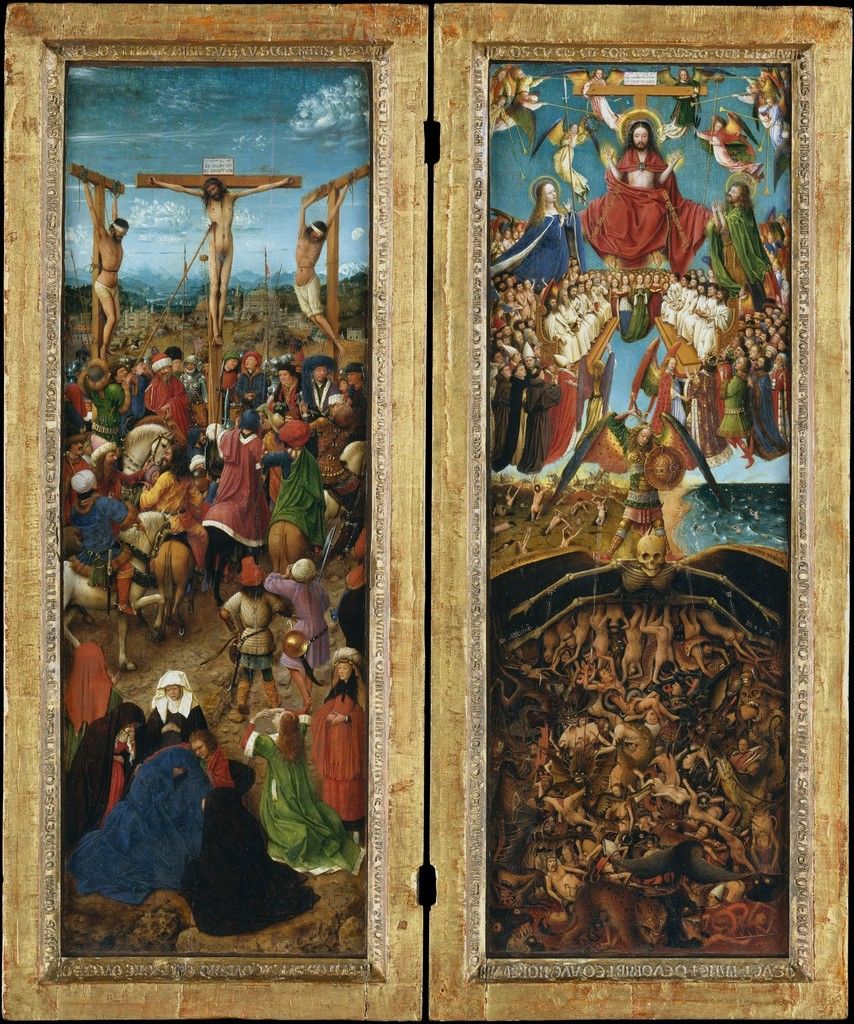
Jan Van Eyck – The Crucifixion and Last Judgement diptych
Both of these panels are full of absolutely astounding detail, and it’s difficult to see how much until you truly look at both panels thoroughly. On the left, you will see the crucifixion of Christ. If you look closely, the small city in the back is Jerusalem. Going down from the top you can see smiles on the men, or looks of indifference. There is a man in green with a fur-lined helmet that is actually stabbing Christ, and although you can’t fully see his face and whether he has a look of pain, indifference or even joy, it can strike a chord to see such violence portrayed even in just a painting. Going down further, you can see Christs’ followers weeping his crucifixion. I think this display of pure conflicting emotions displayed (happy or indifferent men participating or being watchers of Christs’ crucifixion, weeping, mourning followers of Christ) is meant to inflict emotion on those who look at it. The right hand side is portraying the Last Judgement. Going from top to bottom you see angels playing instruments and two people on either side of a now risen Christ. The people directly below him are saints, virgins, apostles and nobility. Going down even further, you can see the resurrected awaiting judgement, and even further down you see a hellish landscape of naked bodies being eaten by hellish creatures (The Crucifixion; The Last Judgment, ca. 1440–41). Although this oil painting seems a little morose, I would love to own this. The emotions Jan Van Eyck was able to elicit and the amazing detail he was able to portray in such a small frame is astounding.
Every time I look at it I notice something I didn’t notice before, which is what makes it so intriguing to me. How the light from Jerusalem is light blue with clouds, and the further it goes above Christs’ head it looks more and more foreboding with darker clouds, while in the other panel you can only see happy blue skies which is such a contrast with the hell-scape down below. Originally it was painted on 56.5 x 19.7 cm wide. The amount of detail painted into such a small space is quite astonishing (Van Eyck, The Crucifixion; The Last Judgment).
Jan Van Eyck was able to perfect the medium of oil painting, making him a prime example of a Humanist Renaissance artist (The Crucifixion; The Last Judgment, ca. 1440–41).
He also got paid very well for his paintings, which in turn caused him to give no mind to painting those who were needy or hungry, and instead painted what would appeal to the rich. This influence of royalty allowed his oil paintings to have heavy, rich colors as well as beautiful light colors that could make a crown to appear glowing, or nightmarish creatures look especially hellish (Cheryl Van Buskirk, 2018).
Mary Pownall studied in Rome from 1898 – 1901, which is where she got the inspiration for her marble harpy sculpture.
I added the two photos so you can see the contrast from soft yellow light to a harsher flash. In the first picture presented the harpy could almost be mistaken for a vengeful angel, but in the second photo you can see the details of her talons and claws, her furrowed brow and cold stare.
Although Mary Pownall was a British sculptor, her “Harpy Celaeno” was modeled after Ancient Greek mythology and sculptures. According to Greek mythology, Harpies were female monsters who would cause mischief and torment, especially upon men. What I find beautiful about this, and what I hope I can properly convey to all of you, is that often times in art and culture, strong women can be referred to by foul names and harsh criticism. A harpy to me, at least, signifies an amalgam of strong female characteristics and femininity turned sour by the male dominant culture of Greeks and Romans.
I think it’s so beautiful how she was able to show such emotion through marble sculpting, and how this sculpture can elicit such different emotions in those who look at it.